BROWN | A STUDY

There’s always been a place for warm neutrals within the colour palette of a carpet tile collection; however, the use of ‘true’ brown is quite often limited, particularly in the UK. At burmatex, we have a wide variety of brown shades across multiple ranges, of which some are bolder than others. But why limit brown to small areas of use or play safe with a washed out warm-neutral? With the shift towards warmer neutrals and the increased use of brown in trend imagery, there’s been no better time to be bold with brown.
INSPIRATION
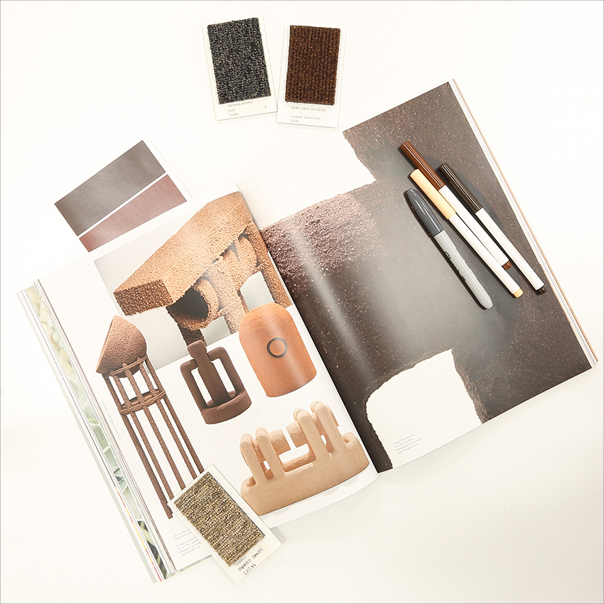
The following images are a photographic study of how different browns can be used together in different combinations and different quantities. These images are a photographic representation of how a designer may consider different product options at the start of a project, and how the scheme can be built layer by layer, with reference to trend imagery and the objects around us.
CARPET SCHEMES
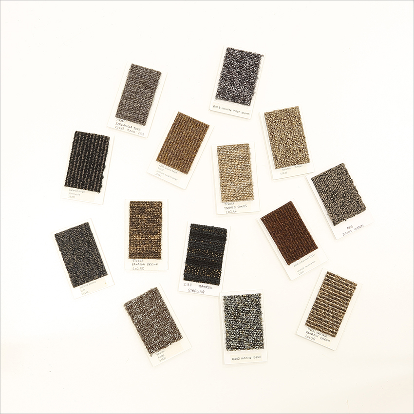
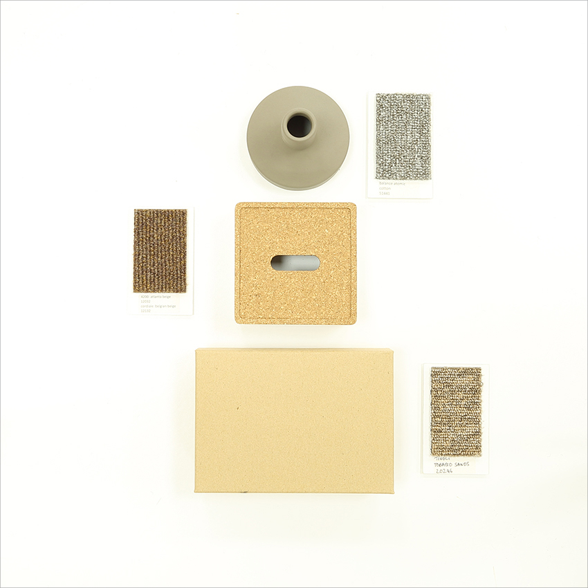
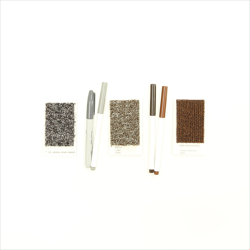
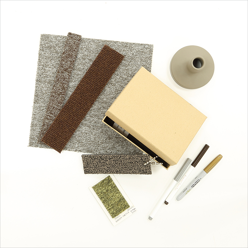
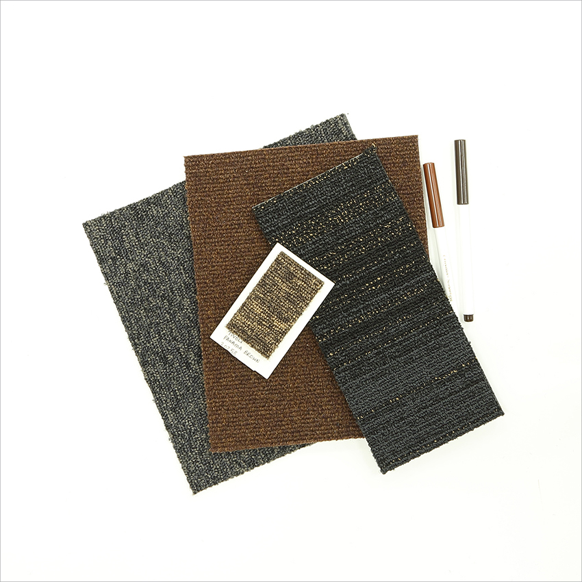
A good way to consider the different colour use within a scheme is to look at the colours in sample sizes that are representative of the quantities that will be used within the scheme. This gives a more accurate representation of what the overall scheme would look and feel like. For example, if you are going to use 50% charcoal, 25% dark brown and 25% light brown, you could lay out a full sample tile of charcoal and two half sample tiles of dark brown and light brown. If you want to use a hint of an accent colour, place a small sample on top of the full and half tiles. It is also useful to place colours next to each other that will be next to each once installed.
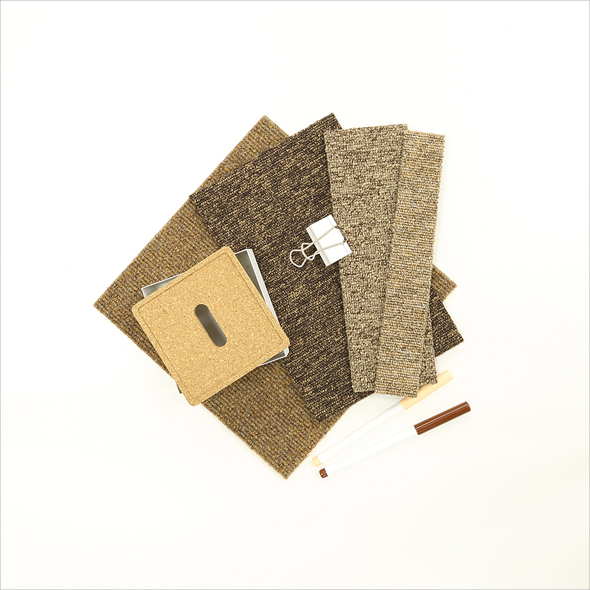
PRODUCTS:
balance atomic - soot
cordiale - cuban rum
tivoli - panama brown
hadron - starling
PRODUCTS:
cordiale - belgian beige
tivoli - panama brown
balance - timber
tivoli - tobago sands
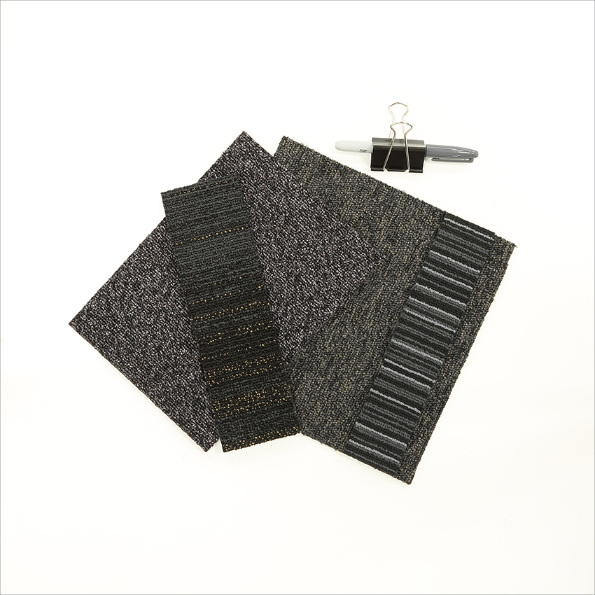
PRODUCTS:
infinity - black hole
hadron - starling
balance atomic - soot
strands - night sixty
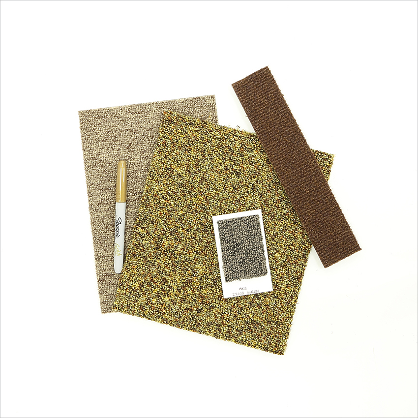
PRODUCTS:
balance - timber
infinity - starburst
axis - wren
cordiale - cuban rum
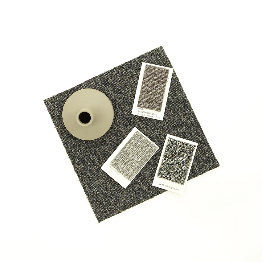
PRODUCTS:
balance atomic - soot
balance atomic - cotton
tivoli - serranilla stone
infinity - fossil
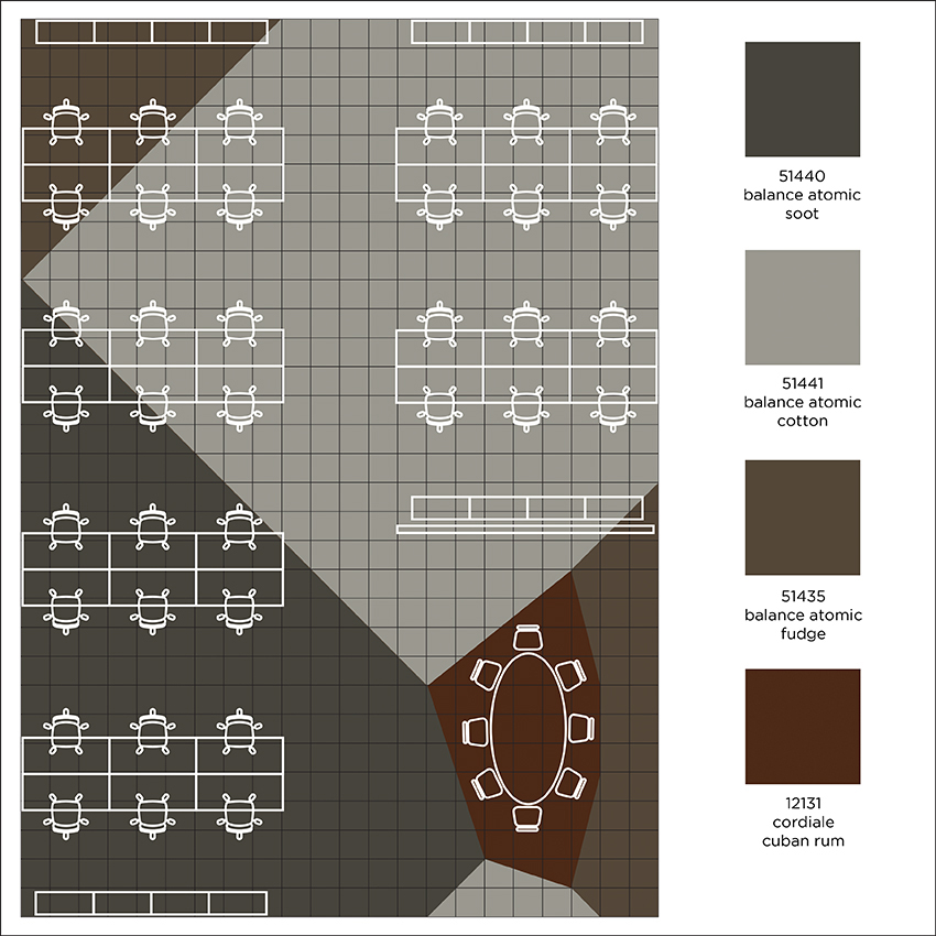
FLOOR DESIGN
Once the colours have been chosen and the rough proportions of each have been established, the colours can then be planned into a floor design like the example below. In this design, three shades of the same range (balance) have been used for the majority of the office floor, but then a different product (cordiale) has been chosen to create a feature area under the meeting table. The use of a different product with a change of texture and bold appearance is a great way to create a focal point within a space and make use of such a solid bold colour.
For further colour inspiration, click here.
Posted on 12 January 2018
Read More
COLOUR LINK™ - ROCKLINES®
Our Blog
COLOUR LINK™ - ROCKLINES®
Following on from our new carpet tile range o...
NEW rocklines® carbon neutral carpet tiles
Our Blog
NEW rocklines® carbon neutral carpet tiles
rocklines® is inspired by the markings seen ...

NEW threads® low carbon carpet tiles
Our Blog
NEW threads® low carbon carpet tiles
threads® is inspired by connecting strands ...
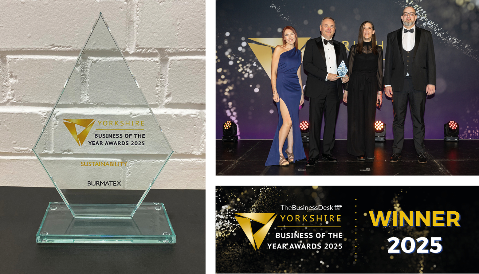
Burmatex® wins Yorkshire Business of the Ye...
Our Blog
Burmatex® wins Yorkshire Business of the Ye...
Burmatex®, the design-led specialist floorin...