HOW TO USE | BRIGHT COLOURS

As a company, we are well known for our bright and bold use of colour. This post highlights some of our favourite ways to introduce brightness, colour and pop into a space. Perfect for when you want to inject some fun colours into an interior scheme.
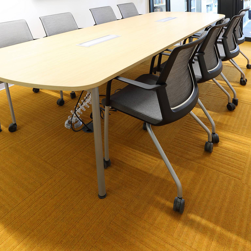
You can choose to go for your brights in other ways, (furnishings, wall colour, blinds or doors) but this doesn't necessarily mean forgoing colour on the floor as well. As we manufacturer carpet tiles, you can utilise the modular aspect of them to get in some colour without committing to the whole floor - although we're not against that either!
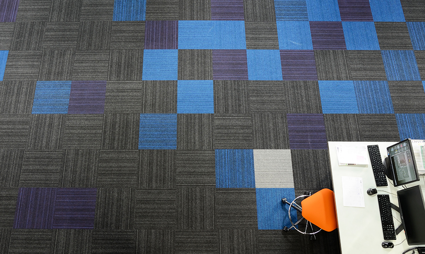
Pixels
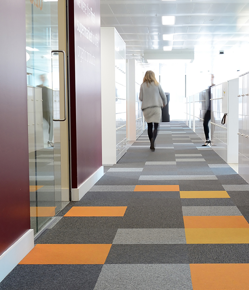
Sainsbury's Offices, London - balance and cordiale
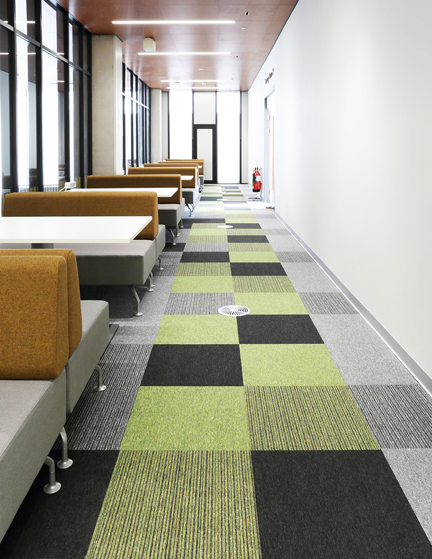
Birmingham University Library - tivoli and tivoli multiline
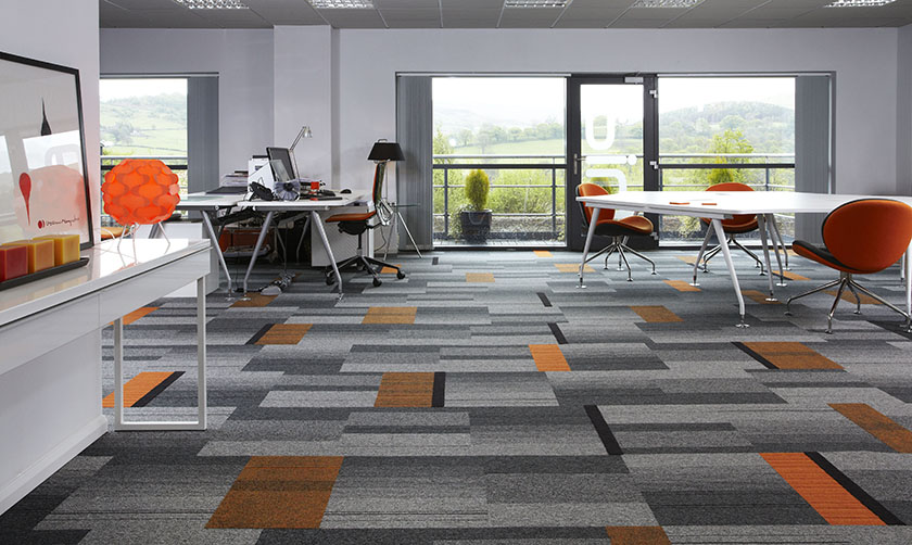
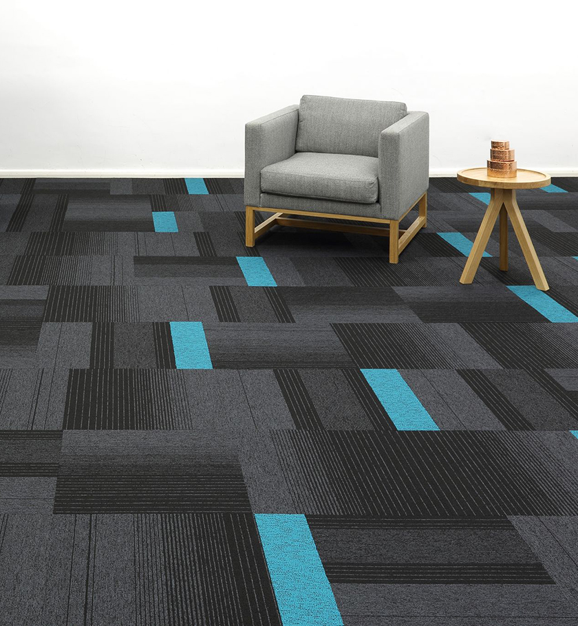
Pixellating bright colours is a very popular method for introducing colour into a flooring scheme. You can use this pixel method to highlight walkways, entrances or break out spaces. By using one or more colour, you can easily build up the coverage - depending on how adventurous you or your client are feeling!
Borders
Borders are sometimes seen as slightly old-fashioned for floors now. Though there are still many ways to use them that feel and look new. One of our preferred ways is to combine different products in the same colour to denote an area of focus or interest.
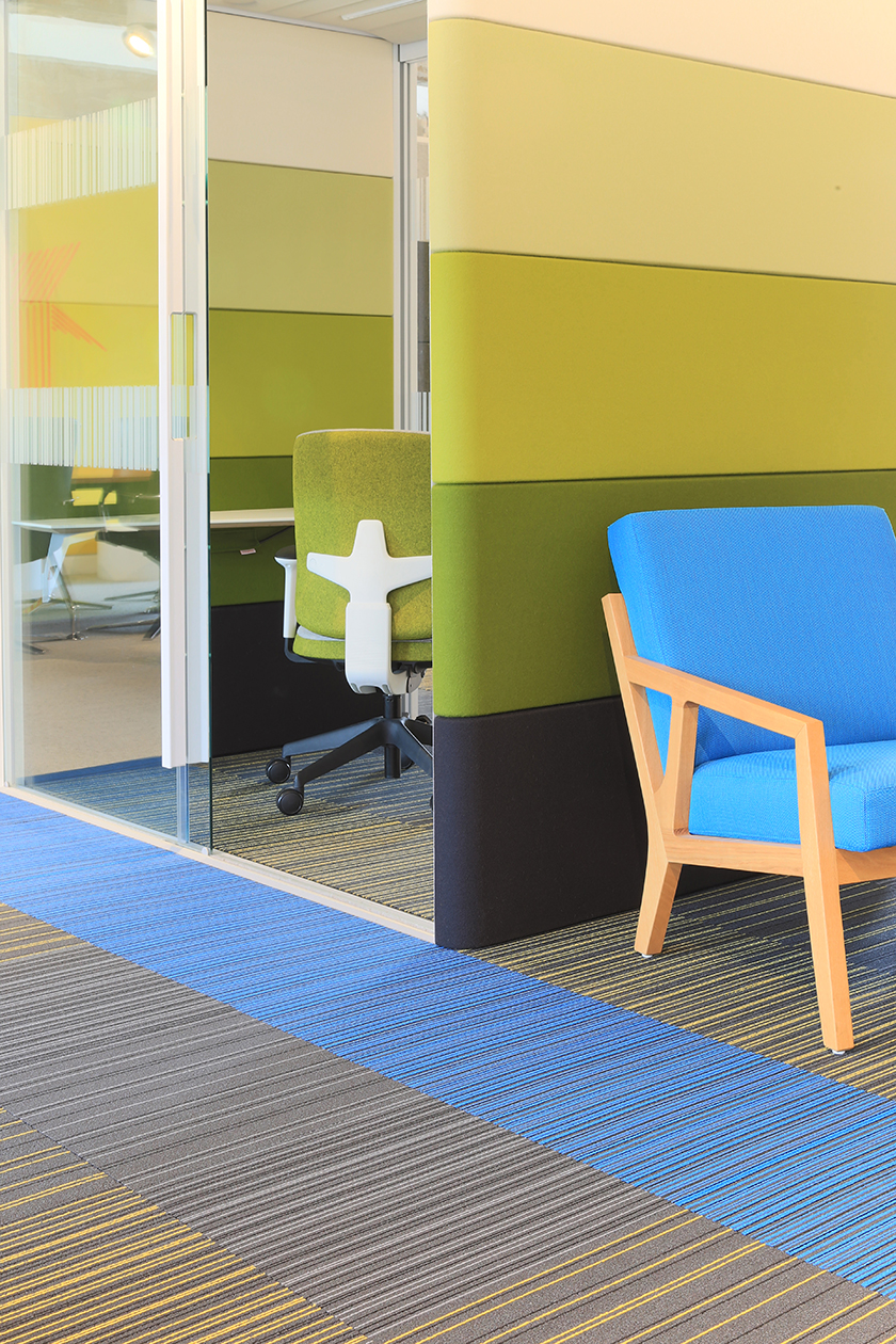
strands with Orangebox furniture
The images below are from Boston College, where each classroom has a different colour highlighting the teaching area. This use of colour subliminally draws attention and focus to the front of the room.
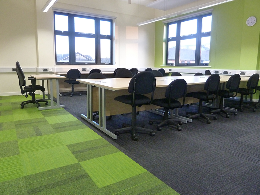
Boston College, Lincolnshire - lateral, zip and code
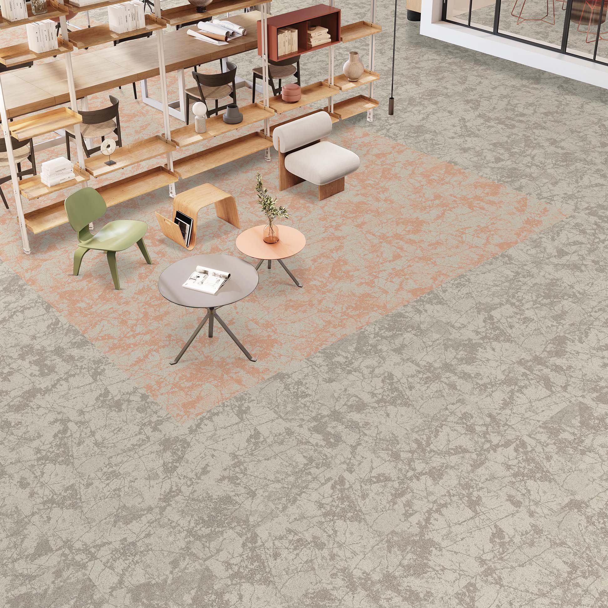
Slivers
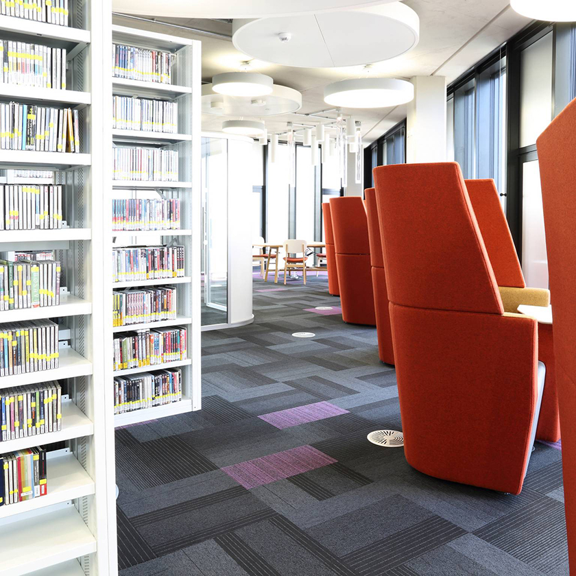
Birmingham University Library - balance echo and code
Ibbotson Architects, Derbyshire - balance atomic, lateral and code
A more subtle way to work with colour is to use cut segments from a carpet tile. By cutting the tile into halves, quarters or fifths, you are distributing colour throughout a space without overwhelming it. An excellent way to tie together a colour scheme or hint at corporate branding.
Studio installation - balance echo and up
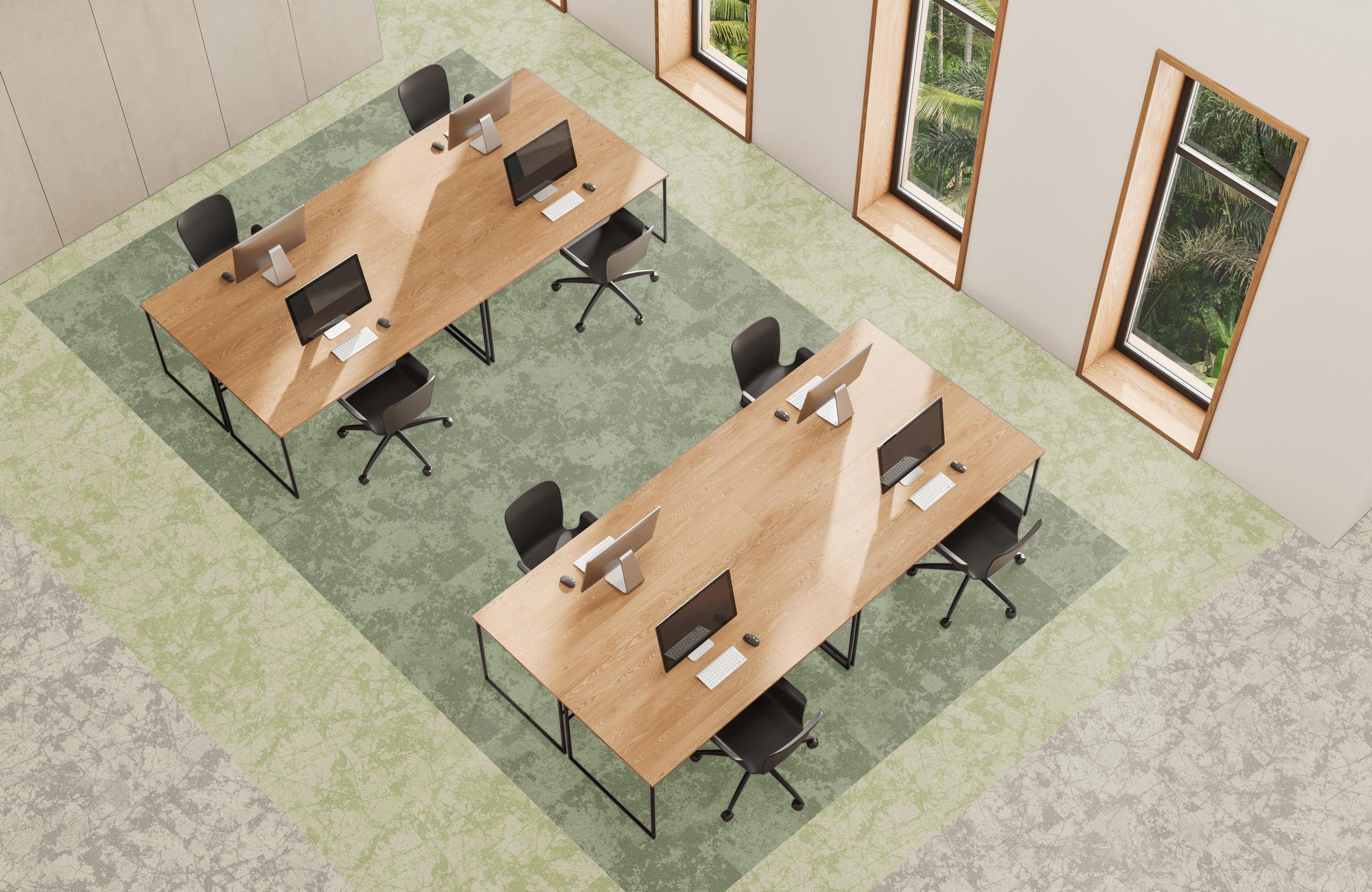
All over
North Uist Primary School - broadway
Virgin Trains Offices, London - up
By keeping the rest of your space rather minimal in terms of colour and pattern, you can go all out with the flooring. We love it when we see our clients being bold and using one colour throughout an installation.
Birmingham University Library - lateral
Rainbow
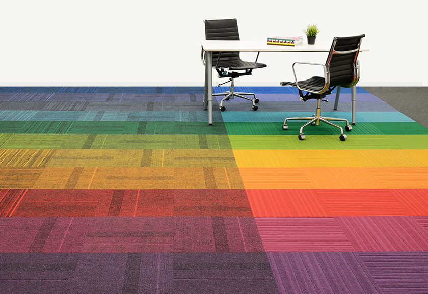
Studio installation - lateral, zip and code
The most dramatic use of our colourful products, this installation is great for reception areas or spaces you want to feel fun and alive. This is easily transferable into a slither option as well, for walkways or smaller spaces.
Posted on 18 July 2017
Read More
COLOUR LINK™ - ROCKLINES®
Our Blog
COLOUR LINK™ - ROCKLINES®
Following on from our new carpet tile range o...
NEW rocklines® carbon neutral carpet tiles
Our Blog
NEW rocklines® carbon neutral carpet tiles
rocklines® is inspired by the markings seen ...

NEW threads® low carbon carpet tiles
Our Blog
NEW threads® low carbon carpet tiles
threads® is inspired by connecting strands ...
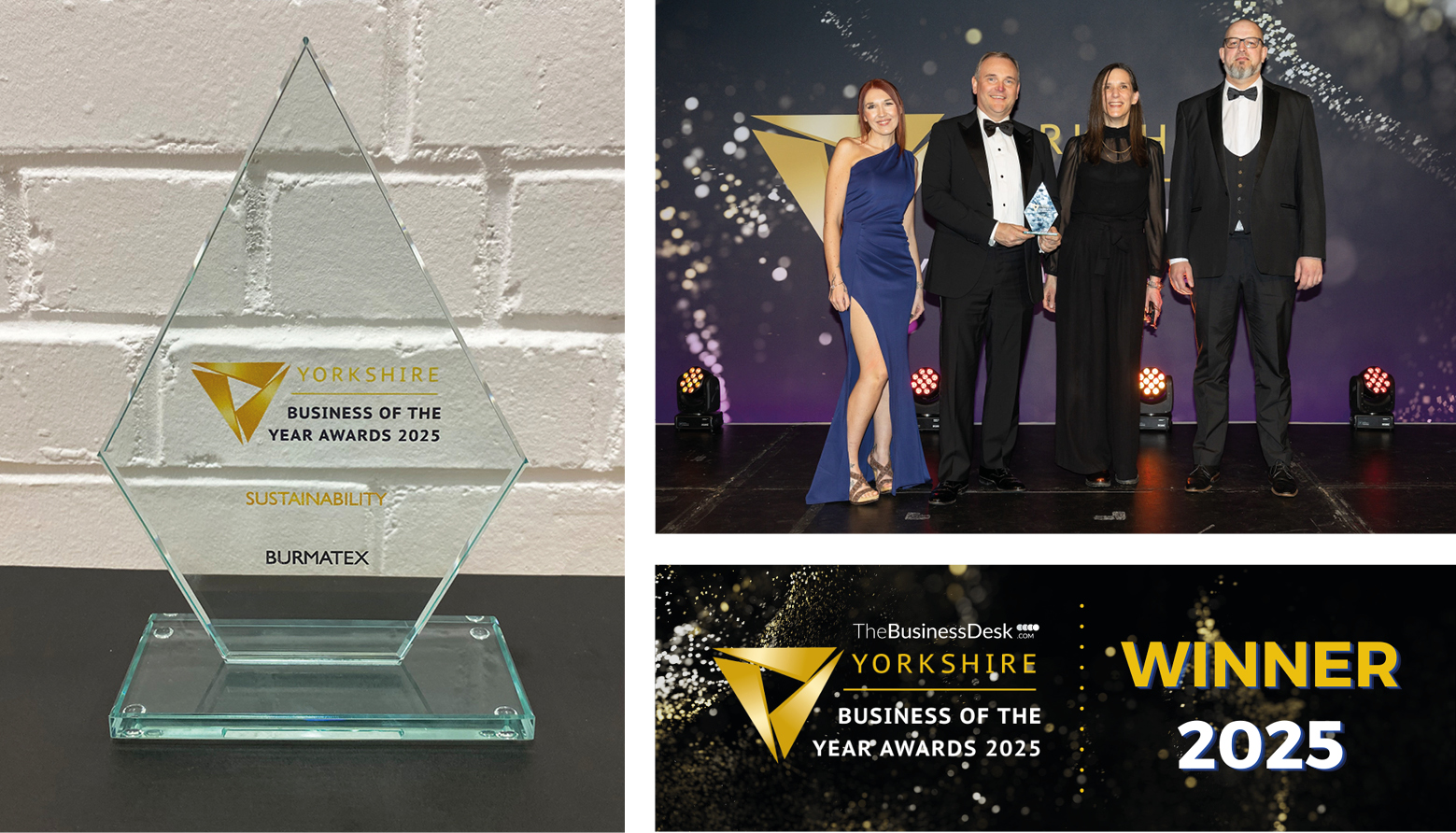
Burmatex® wins Yorkshire Business of the Ye...
Our Blog
Burmatex® wins Yorkshire Business of the Ye...
Burmatex®, the design-led specialist floorin...