PANTONE COLOUR OF THE YEAR 2018 | ULTRAVIOLET

As soon as the first of December rolls around, all of us in the burmatex design department are impatiently awaiting the announcement from Pantone of what the new years "colour of the year" will be.
For 2018, we have moved on from Greenery 15-0343 to Ultraviolet 18-3838.
“It’s the most complex of all colors; it takes two shades that are seemingly diametrically opposed — blue and red — and brings them together to create something new.”
-
A dramatic purple shade, also connected to the wellness movement (like Greenery) when you consider the link to amethyst crystals and the mystical, magical and hopeful aura that Ultraviolet exudes. Images of galaxies, neon hints and futuristic vibes accompany the launch on Pantone's website.
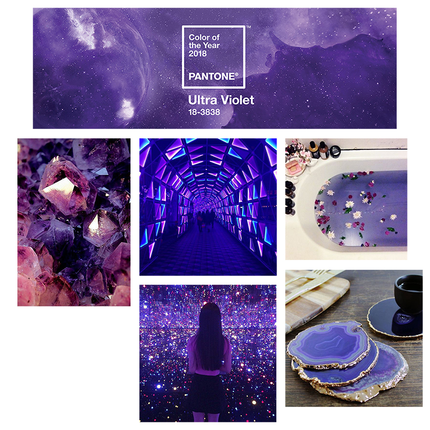
image sources L-R: pantone, pinterest, the tokyo dome, pinterest, pinterest, not on the high street
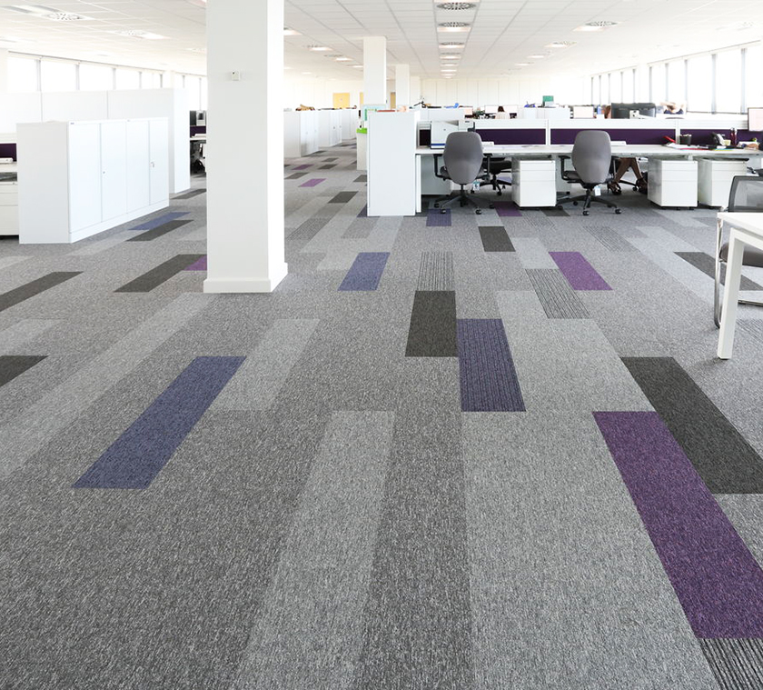
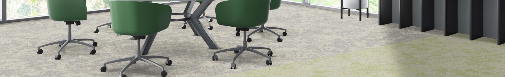
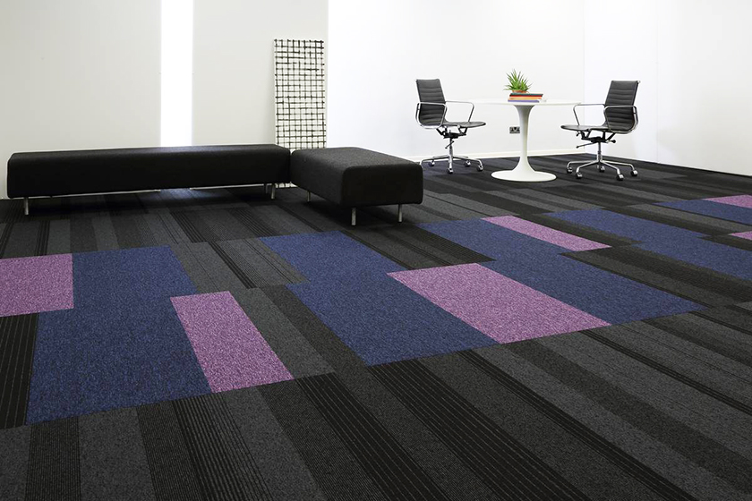
TIVOLI PLANKS | EL GROUP OFFICES
products L-R: infinity, code, grade, hadron, lateral, tivoli
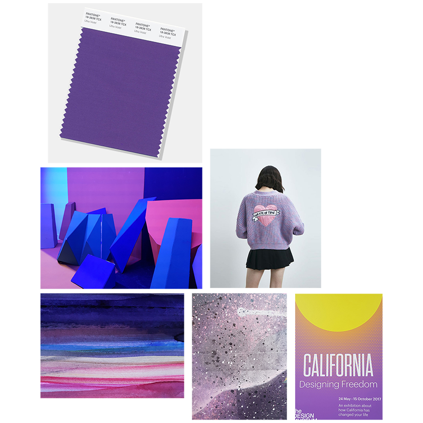
image sources L-R: pantone, hella jongerius breathing colour (the design museum), lazy oaf, designers own, designers own, california designing freedom (the design museum)
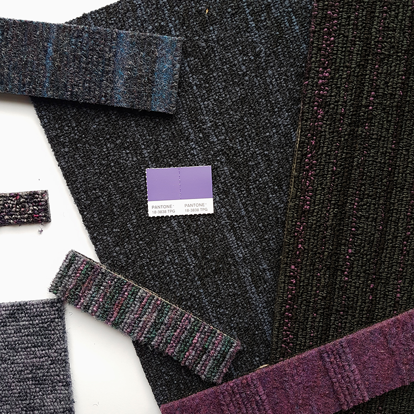
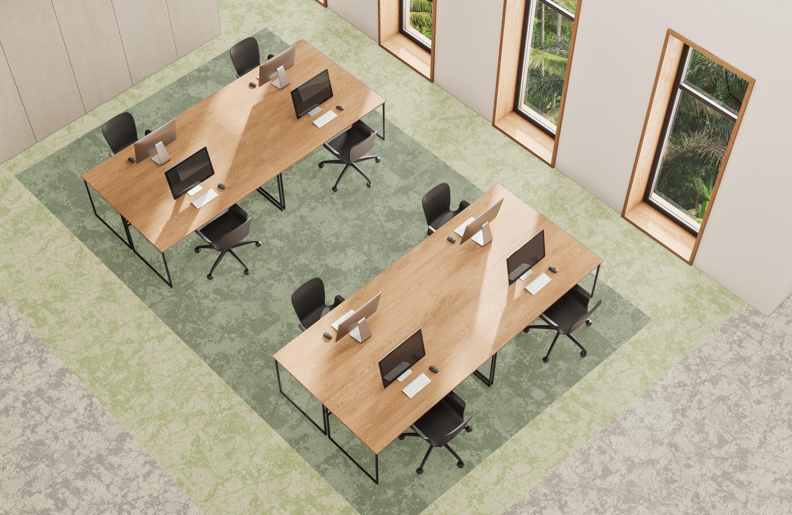
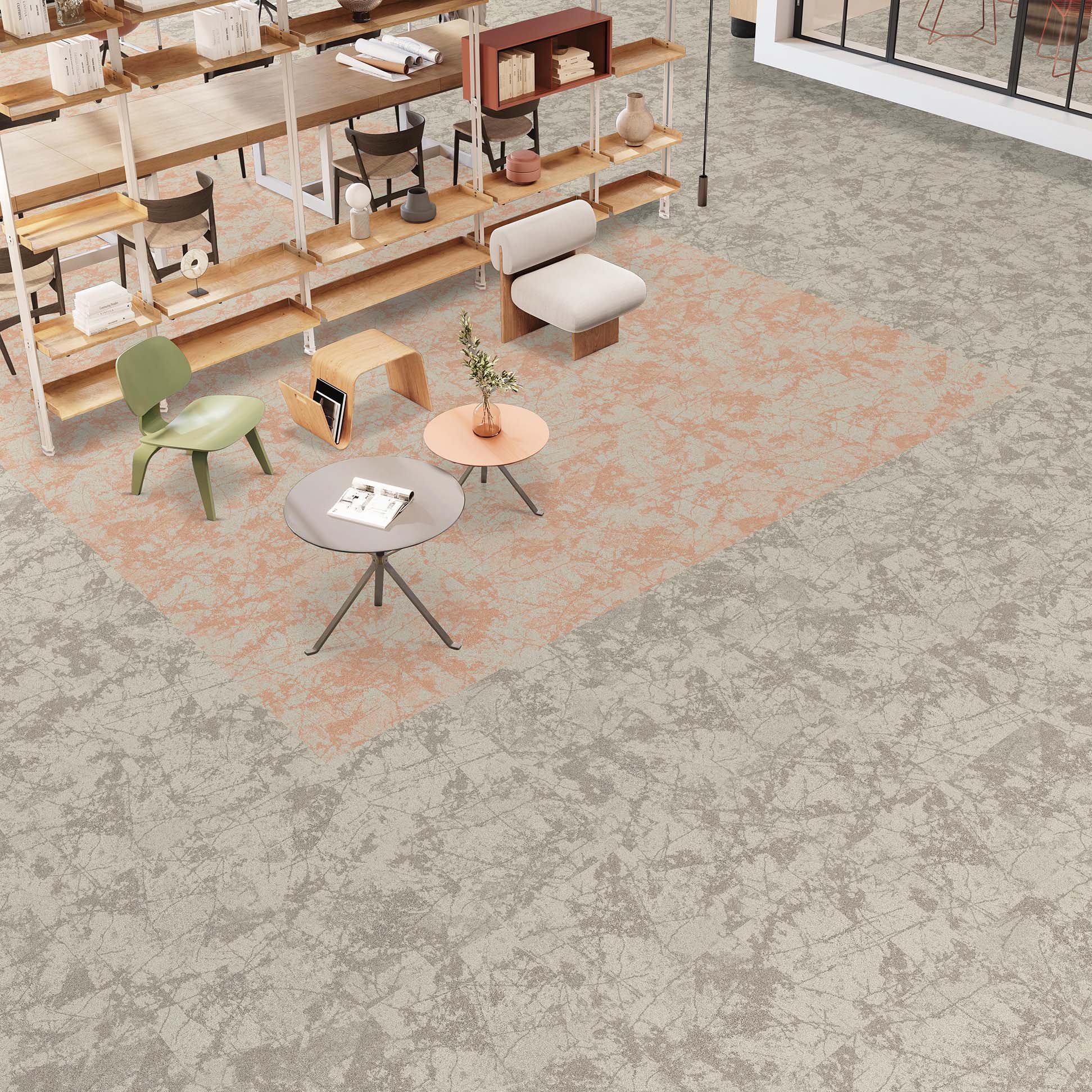
BALANCE ECHO, TIVOLI PLANKS | STUDIO PHOTOGRAPHY
-
You can see more purple installation images from us here and we will also be updating our colour of the year Pinterest board throughout 2018 too!
-
Posted on 11 December 2017
Read More
COLOUR LINK™ - ROCKLINES®
Our Blog
COLOUR LINK™ - ROCKLINES®
Following on from our new carpet tile range o...
NEW rocklines® carbon neutral carpet tiles
Our Blog
NEW rocklines® carbon neutral carpet tiles
rocklines® is inspired by the markings seen ...

NEW threads® low carbon carpet tiles
Our Blog
NEW threads® low carbon carpet tiles
threads® is inspired by connecting strands ...
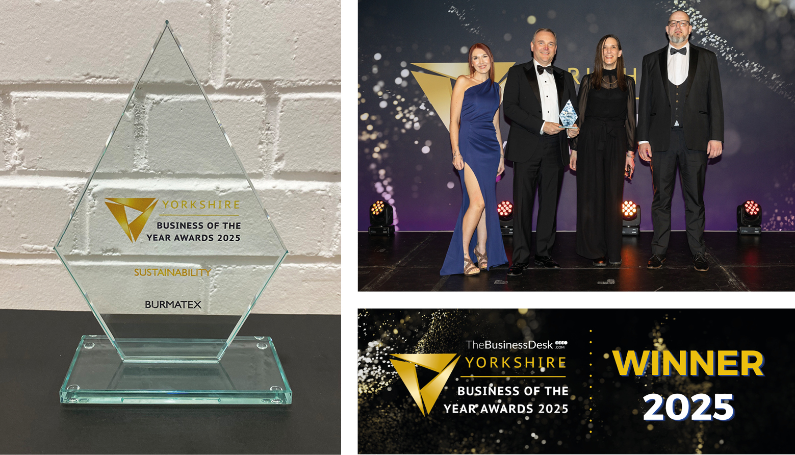
Burmatex® wins Yorkshire Business of the Ye...
Our Blog
Burmatex® wins Yorkshire Business of the Ye...
Burmatex®, the design-led specialist floorin...