HOW TO USE | DARK COLOURS

burmatex offer a wide spectrum of carpet tile colours; from light grey to bright lime, punchy orange and all the way down to the darkest of blacks. This post is specifically focusing on the deeper hues that we offer - detailing some advice on how to use them successfully and mindfully in a space, without creating an environment devoid of light or texture.
A dark floor adds drama to any interior, from education to office space. Especially when teamed up with bright accent finishes and natural light. It can be the equivalent to using a bright colour in terms of impact, whilst also looking sophisticated and smart.
Below are our top three tips on how to utilise dark carpet tiles, along with images from case studies to inspire!
-
Focus on light or bright tones for walls and furnishings

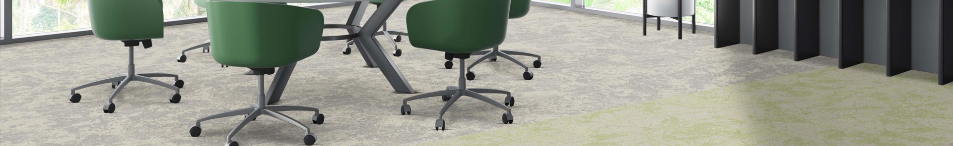
Access Interiors Offices, St Ives
Product used: balance echo

Darwin Academy, Staffordshire
Product used: lateral

Malin Group Offices, Glasgow
Product used: infinity

Sheffield Hallam, Sheffield
Product used: balance stripe, strands
-
Pair with bright accents on the floor

AST Signs Offices, Cumbria

Dalmark Group Offices, Peterborough
Products used: balance echo, up /down

Degree 53 Offices, Manchester
Product used: tivoli plank

HSR2 College, Birmingham
Products used: balance greyscale, strands, tandem
-
Utilise natural light

University of Birmingham Library, Birmingham
Product used: tivoli

Bradford College, Yorkshire
Products used: balance greyscale, strands, tandem

Brunner Offices, London
Product used: strands

College of West Anglia, Wisbech
Products used: up, tivoli
-
Posted on 22 October 2025
Read More

Pantone Colour of the Year 2026
Our Blog
Pantone Colour of the Year 2026
This month Pantone announced their Colour of ...

surface trace® works with balance collectio...
Our Blog
surface trace® works with balance collectio...
Our latest carpet tile launch of surface trac...

Explore surface trace® by Burmatex
Our Blog
Explore surface trace® by Burmatex
Explore surface trace® by Burmatex
A ...

NEW rocklines® carbon neutral carpet tiles
Our Blog
NEW rocklines® carbon neutral carpet tiles
rocklines® is inspired by the markings seen ...