RAL Colour Feeling 2027

This month we attended the online launch of RAL’s Colour Feeling 2027+, always an inspiring and integral part of our development process, to stay ahead of trends and understand colours that will become an important part of spaces being developed now. This ensures we have the necessary colours to offer to our customers at their point of needing them.
The talk details colours that have been part of trend reports since 2020 – gradually becoming increasingly important within palettes since then, as well as 15 new shades. This focus on sustainable trend development feeds into our ecomatters ethos, creating products that will not only look good now but reflect trends to come & continue to look good in the coming years.
Here we have looked at how we can fulfil some of RALs key colour palettes within our current portfolio, whether as accent colours, zoning colours or main field neutrals.
FOCUS
This story is all about clarity and concise design – creating functional environments that support user’s functionality, this story works beautifully with our collection of commercial designs & colours.

FEEL

A tactile & sensitive approach to design, incorporating rich colours and warmth within an interior, perfect for creating characterful spaces. Our range of neutrals & muted colour accents work perfectly to provide a cosy base for these rich and inviting spaces.

RELAX

Featuring colour combinations that create a calming, balanced atmosphere to promote wellbeing within nature inspired spaces – allowing individuals to take a breath, seen here with suitable ranges from our portfolio to provide quiet & calming areas.

COMMUNICATE
This colour story is perfect for designing collaborative spaces that thrive on diverse colours, inclusive design that creates conversation. These more vibrant tones touch on accent colours within our portfolio perfect for creating collaborative zones

PLAY

The colour feeling for Play really fed into the need for dynamic spaces for multiple uses, creating engaging and interesting spaces that inspire experimentation & creativity.
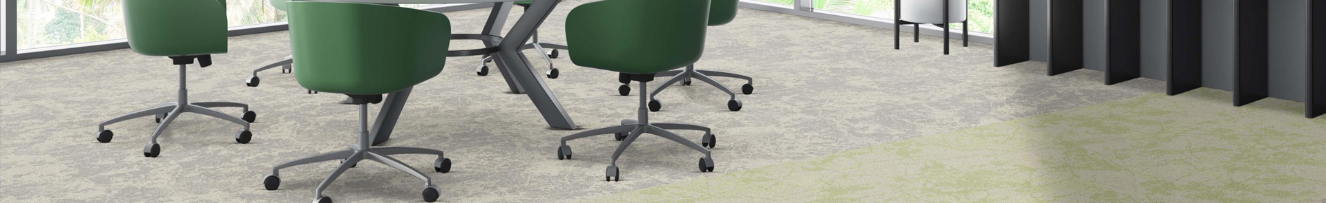
The vibrant green & pink pairing gives an energising feel, paired with some of our carpet tiles below to demonstrate how these colours could be taken into new spaces – either through carpet colours, or accents within furniture/wall colours

Ranges featured:
rocklines®, threads®, snowfall®, standing stones®, balance collection®, osaka®, alaska®, arctic®
Posted on 30 October 2025
Read More

Pantone Colour of the Year 2026
Our Blog
Pantone Colour of the Year 2026
This month Pantone announced their Colour of ...

surface trace® works with balance collectio...
Our Blog
surface trace® works with balance collectio...
Our latest carpet tile launch of surface trac...

Explore surface trace® by Burmatex
Our Blog
Explore surface trace® by Burmatex
Explore surface trace® by Burmatex
A ...

NEW rocklines® carbon neutral carpet tiles
Our Blog
NEW rocklines® carbon neutral carpet tiles
rocklines® is inspired by the markings seen ...